Welcome to our brand guidelines
Introduction
Welcome to the Delfin Technologies' brand guidelines, your essential resource for maintaining consistency and effectively representing our brand across all touch points. These guidelines ensure that every interaction with our brand embodies our values of innovation, sustainability, and customer-centricity.
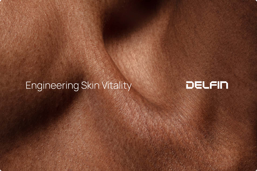
Engineering Skin Vitality
At Delfin Technologies, we empower better lives through innovative solutions that measure, analyze, and unlock valuable insights into skin health. Our devices deliver actionable insights, enabling professionals to improve treatments, develop superior products, and unlock new possibilities in skin health and research.
Purpose
Our purpose is to provide innovative solutions that enhance health and well-being, ensuring better quality of life and healthier world.
Mission
We relentlessly innovate, pushing the boundaries of research, science, and technology to develop superior solutions for skin health.
Our mission is to be the leading company in skin and lymphedema measurement devices, delivering the best, most innovative, and customer-focused solutions that enhance health and well-being. We strive to set the standard for excellence, being a trusted partner, a respected employer, and a driving force for positive change in skin research and healthcare.
Vision
To be the global leader in skin and lymphedema measurement solutions, empowering millions of people to achieve better health and well-being through solutions that set standards for lymphedema care and skin research.
Values and beliefs
Together, we grow
We believe in achieving success through collaboration, treating each other with respect, and building strong partnerships with our employees and customers.
Excellence in everything
We are committed to deliveringthe highest standards in everything we do, from innovation and productdevelopment to customer service, striving for continuous improvement andoutstanding results.
Driven by purpose
We take pride in creating solutions that serve the common good, improving quality of life through innovative med/health technology that makes a meaningful difference for millions worldwide.
Tone of Voice
Our communication is clear, professional, and empathetic. We aim to make complex scientific information accessible, reflecting our commitment to supporting professionals in their work.
Logotype
As a visual representation of Delfin Technologies, our logo encapsulates the essence of our identity and values. It serves as a powerful symbol that communicates our commitment to innovation, sustainability, and excellence. This section provides detailed guidelines on the correct usage, variations, and applications of our logo, ensuring consistent and impactful representation across all brand materials.
By adhering to these guidelines, we maintain a cohesive brand image that resonates with our audience and reinforces our brand identity.
<a href="https://www.dropbox.com/scl/fo/wsvbbrva1dvvp4jc629co/ALbn75AP5V2Pr-R-btrA894?rlkey=nerss0vl48ceibyb8nmue8d9h&dl=0" class="db-button" target="_blank">Download logo</a>
Symbol
The first letter of the logo, D, can be used as a stand-alone symbol in applications where the full logotype does not fit such as website favicon.
White space
The safe area around our logo is a designated space that ensures its visibility and integrity by keeping other elements at a distance. This white space allows our logo to make a strong impact and maintain visual consistency across all applications.
Ensure the logo has sufficient white space around it to breathe and that the logo remains clearly visible when placed on a colored background or an image.
Usage
The logo should not be misinterpreted, modified, or added to. Its orientation, color, and composition should remain as indicated in this document — there are no exceptions. Here is a list of do’s and dont’s to help us maintain the integrity and recognition of the Company brand.
Do’s
Do keep the appearance of the logo consistent through out the channels.
{{images-3-1="/rtc"}}
Dont’s
{{images-4-1="/rtc"}}
{{images-4-2="/rtc"}}
Typography
Typography is a key element in conveying our brand's personality and delivering a clear message. This section outlines our carefully selected typefaces, font sizes, and spacing guidelines. By adhering to these typography guidelines, we ensure consistency and coherence across all textual elements, creating a cohesive and engaging brand experience.
Brand typeface
Our brand typeface is Manrope. Manrope is an open-source modern sans-serif font family, designed by Mikhail Sharanda in 2018. Manrope is designed to work in all digital channels. You can access the font files here.
For use cases when custom font is not possible, use Arial as a fallback font typeface.
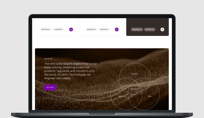
Colors
Our color palette reflects our scientific foundation and commitment to skin health. Adhering to these color guidelines ensures consistency and coherence across all brand materials.
Primary colors
Our primary brand color is dark purple paired with bright white.
{{brand-colors-3-1="/rtc"}}
Supporting colors
Our strong primary color is balanced by the neutral and clinical grey color palette.
These supporting colors are used in backgrounds for texts and graphics to add visual interest and diversity to our brand materials.
The bright purple accent color is selectively used in supporting graphics and functional elements such as call to action buttons to add visual interest and highlight specific elements within our brand materials.
{{brand-colors-4-1="/rtc"}}
{{brand-colors-4-2="/rtc"}}
Color combinations
Keep in mind readability and accessibility when using our colors especially in writing. Here are a few examples of color combination do’s and dont’s.
Examples of good color combinations.
{{images-4-4="/rtc"}}
Examples of bad color combinations.
{{images-4-5="/rtc"}}
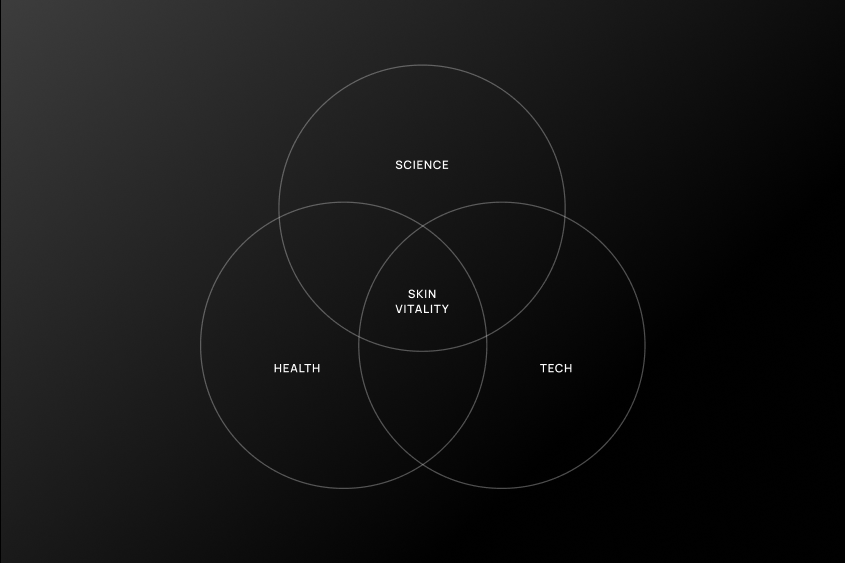
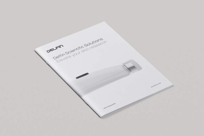
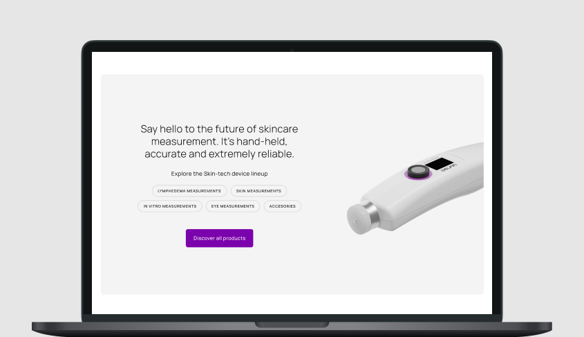
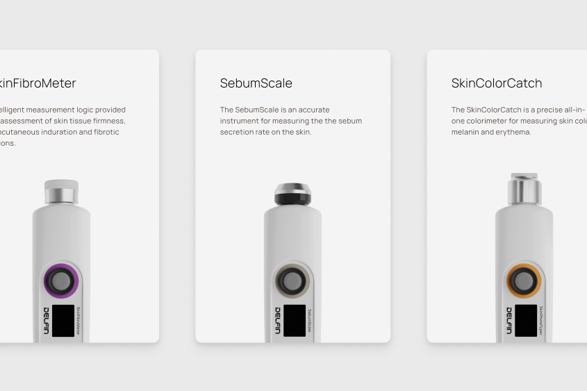
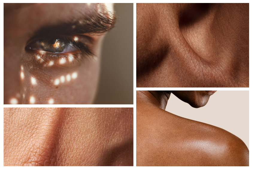
Imagery
Our imagery supports our brand narrative and is categorized into four distinct groups: 1. People, 2. Lab, 3. Skin, and 4. Product images.
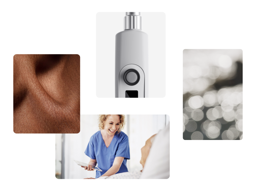
People
Professionals using our devices in clinical and research environments.
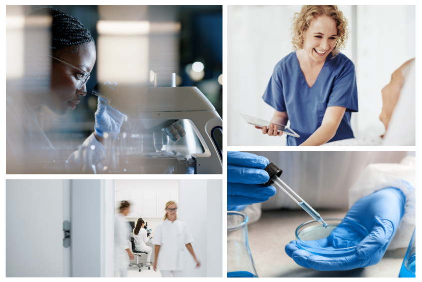
Lab
Scientific close-ups that showcase our devices in research settings.
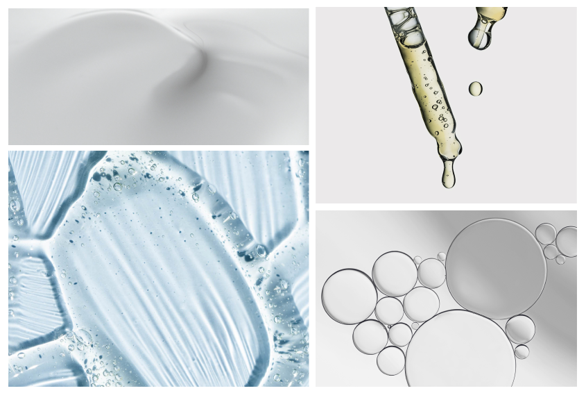
Skin
Detailed images highlighting skin textures and conditions.
Product
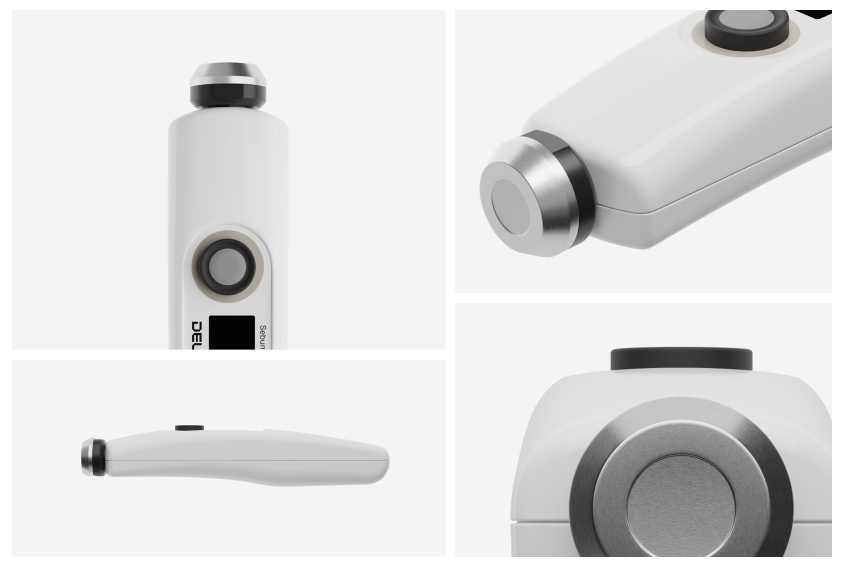
Clean 3D renders that focus on the design and functionality of our products.
Graphics
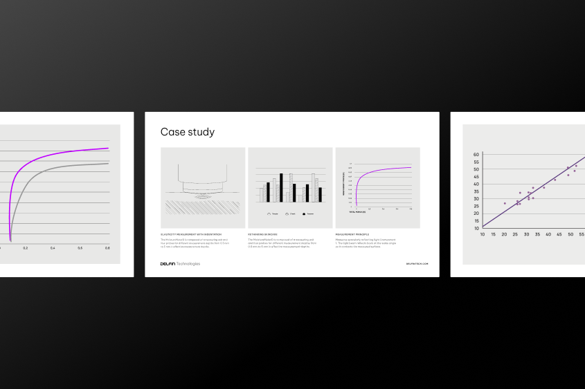
Our graphics style is simplified, clear and black and white. The accent and brand color purple can be used to highlight and differentiate data.
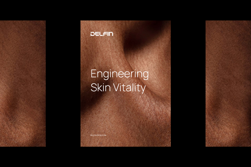
Visual expressions
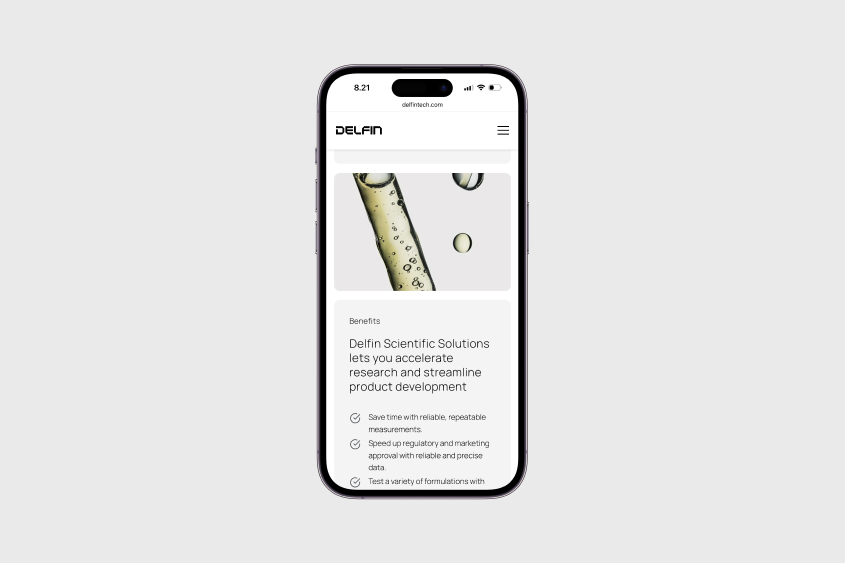
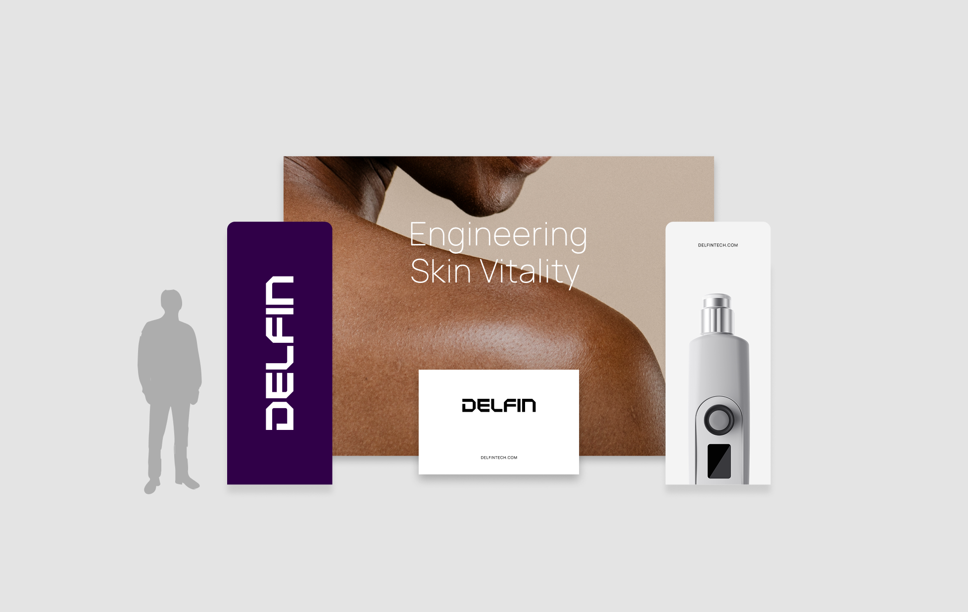
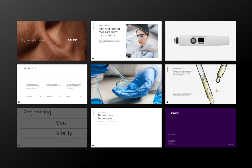
Our brand elements come together across various applications, from digital platforms to printed materials, ensuring a cohesive and professional presence.
We believe that good design is as minimal as possible. Whitespace is beautiful. Whenever a client views our material, they should be intrigued and want to learn more.
Margin size
Margin size depends on the artboard size and the amount of content. In general, keep the logo and text within the content area, while graphics or images can extend beyond this area.
Negative space
Lightness and airiness make for a smooth and easy reading experience. Aim for spacious and airy layouts, leaving plenty of empty space.
Layout rhythm
Pay attention to the relationship between images and text. It's better to use a few large images rather than many small ones, maintaining a calm and stylish layout. If smaller images are desired, several small images can replace a single large one, ensuring the layout rhythm follows the provided guidelines.
Contact us
Contact our marketing team for more information on our brand and press materials.
<a href="https://www.delfintech.com/contact" class="db-button">Get in touch </a>